EU Debt Explained: Why Adding It All Up Helps, and Misleads

Add up the public debt of all 27 EU countries and the figure lands a little above €15.2tn. On the EU Debt Map homepage, that number feels clean. It rises, it flashes, it gives Europe a single fiscal silhouette. That is exactly why it is so seductive. It is also where the confusion starts.
The combined number is real. Eurostat publishes an EU aggregate, and on this site the homepage turns that aggregate into a live estimate. But Europe is not a single borrower in the way the United States is. A continent can share a market, and most of the time a currency, without sharing one treasury, one tax authority or one political risk.
That is the tension worth understanding. The total is useful. It is just not the whole truth.
The number is real, and it is big for a reason
At the end of the third quarter of 2025, the combined government debt of the EU stood at €15.253tn, or 82.1% of GDP. From the previous quarter, the stock of debt rose by roughly €205.6bn. Smoothed out over the quarter, that works out to around €25,900 per second.
That is why a live counter works so well. It takes a stock, which can feel abstract, and turns it into motion. Readers instantly see that public debt is not a dusty year-end statistic. It is a moving object.
Used that way, the combined EU number is not a gimmick. It is a visual shortcut. It tells you that the debt story is large, persistent and still moving.
So why is adding it all up also misleading?
Because the sum looks more unified than the borrower actually is.
The EU aggregate is not the debt of one sovereign state. It is the sum of 27 national governments, each with its own tax base, budget politics, refinancing schedule and tolerance for fiscal stress. Some issue debt from a position of deep market trust. Some do not. Some are inside the euro. Some are not. Even Eurostat notes that the EU total can shift partly because of exchange-rate movements in non-euro member states, and it separately publishes intergovernmental lending as a memo item. In other words, even the neat aggregate comes with caveats built into the plumbing.
This matters because people often look at the total and instinctively ask a very American question: how much does Europe owe? The better question is harder and more European: which governments owe what, under which constraints, and to whom does the market extend the most patience?
The real story starts when you split Europe apart again
The easiest way to see the problem is to compare countries that are often spoken about in the same breath but do not occupy the same fiscal position.
France ended the third quarter of 2025 with government debt of about €3.48tn and a debt-to-GDP ratio of 117.7%. Germany stood at about €2.79tn and 63.0%. Put together, both are part of the same EU mountain. Look separately, and they live on very different terrain.
That is why the combined total should remain the hook, not the conclusion. If you want the real picture, open France and Germany side by side. The contrast tells you more than the aggregate ever could. One country is operating far above the old 60% reference line. The other sits close enough to it that the political conversation is completely different.
The same logic applies across the map. Europe does not carry one debt psychology. It carries many.
Why the comparison with the US is tempting, and why it gets messy fast
It is completely natural to compare Europe with America once the EU total is sitting there in the trillions. The trouble is that the comparison is usually less clean than it looks.
When people talk about US debt, they often mean federal debt. But even in the US there are different measures doing different jobs. Treasury's Debt to the Penny series focuses on total public debt outstanding, which includes debt held by the public and intragovernmental holdings. CBO often focuses more on debt held by the public when it wants to say something economically meaningful about the burden on markets and the wider economy.
That does not make EU-US comparisons useless. It just means the comparison has to be labelled properly. Are you comparing EU-27 general government debt with US federal gross debt? With debt held by the public? With debt relative to GDP? Too many debt arguments collapse because nobody stops to define the measure before making the point.
The overlooked part is not the stock. It is the refinancing clock.
Many readers still think in a simple line: rates up, debt pain up; rates down, debt pain down. Real life is slower than that.
The ECB's deposit facility rate has come down sharply from its 2023 peak and has been 2.00% since June 2025. Even so, euro area government interest payments are projected to keep rising over the next few years. That sounds contradictory until you remember how public debt actually works. Governments refinance over time. Old cheap debt rolls off. New debt is issued into a different market. The pain arrives in layers.
That is one of the easiest things to miss when watching a live debt counter. The total can rise gradually while the budget pressure changes suddenly. A country does not need a dramatic debt explosion to feel fiscally squeezed. It only needs enough debt, enough rollover and enough time.
Three paths from here
1. Managed drift
The most boring path is also probably the most plausible. Debt keeps rising in nominal terms, but not fast enough to trigger a clear crisis. Growth, inflation and gradual refinancing keep the system manageable. Governments complain, markets grumble, and the machine keeps moving.
2. The slow squeeze
This is the quieter danger. No spectacular debt event, no instant panic, just a larger share of public money disappearing into interest costs. Over time, that makes every budget choice more political. Welfare, defence, industrial policy and tax relief all begin to compete for less room than they appeared to have a few years earlier.
3. Fragmentation under stress
A recession, energy shock or geopolitical jump in spending could widen the gap between member states again. In that world, the combined EU debt figure would still look impressive on a homepage, but it would become less informative as an analytical tool. The market would care less about Europe in aggregate and more about who is absorbing the shock badly.
Why the total still belongs on the homepage
Because it does something useful that tables usually fail to do. It makes scale visible.
If you added together every euro of public debt across the EU, you would indeed get a number large enough to invite comparison with superpowers. That is not trivial. It says something about the economic weight of Europe and about the amount of future tax capacity already spoken for.
But the right way to use that number is as an opening shot. It gets the reader in the door. After that, the analysis has to become more national, more uneven and a little less tidy.
Debt is really a claim on the future
In the end, debt debates are not only about accounting. They are about time.
Public debt is a way of moving costs across years, and sometimes across generations. The question is never just how much has been borrowed. It is who still has room to choose later. Which government can still respond to a shock without frightening markets? Which one can still spend politically without losing flexibility financially?
That is why adding up all EU debt is both useful and misleading. Useful, because it reveals the sheer scale of the obligation. Misleading, because it tempts you to imagine a single borrower where none really exists.
So keep the big number in view. Just do not stop there. The homepage counter tells you how large the story is. The country pages, and especially the gap between places like France and Germany, tell you what the story actually means. For a broader ranking view, the debt-to-GDP overview is where the aggregate starts to break into something more honest.
Further Reading
Analysis and data you might have missed

Europe’s Debt Burden in 2026: Which EU Countries Are Under the Most Pressure?
Europe’s public debt is not spread evenly. This data-backed analysis explains why total debt and debt-to-GDP tell two different stories about fiscal pressure in the EU.
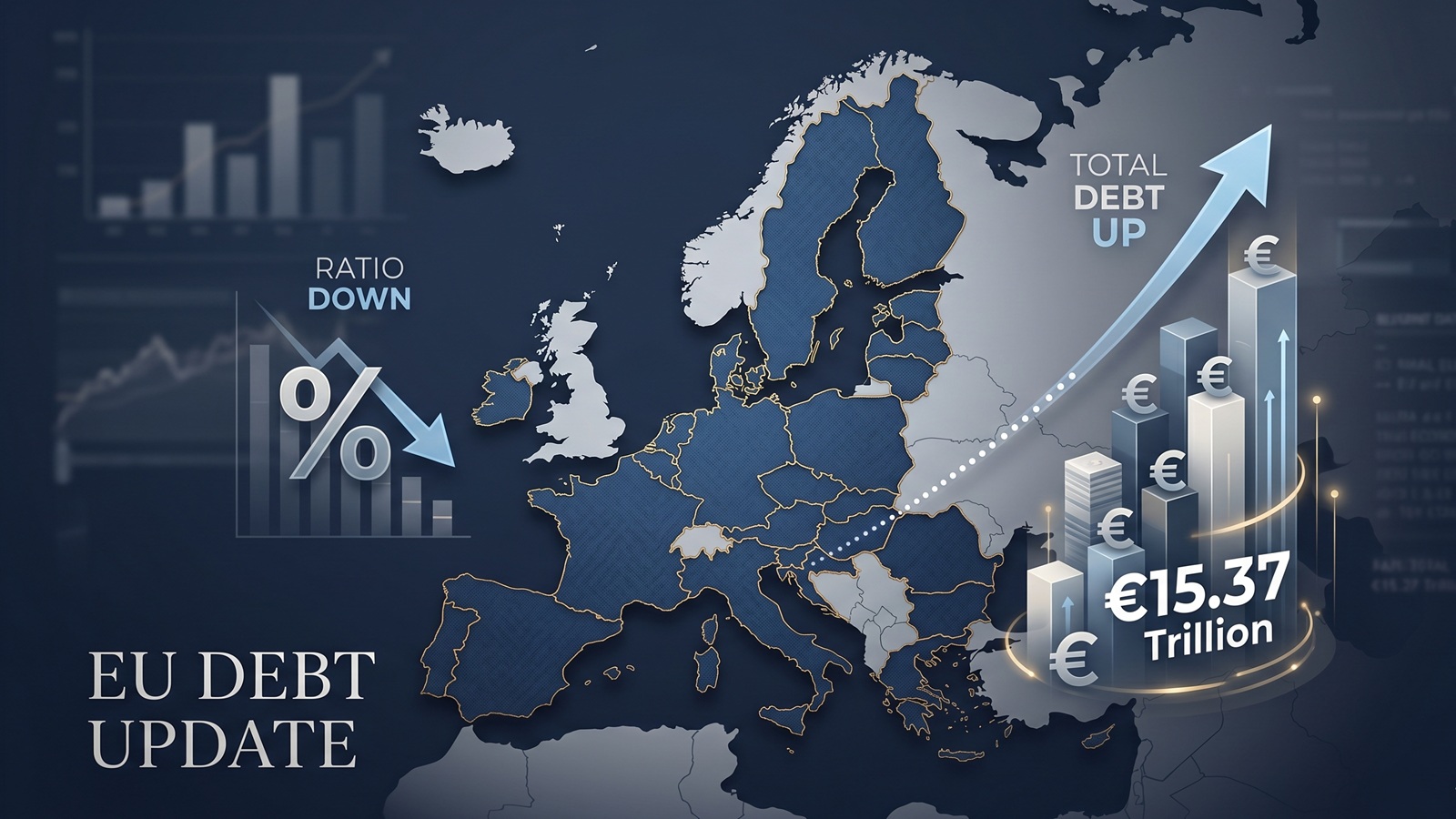
EU debt update: the ratio fell, but the pile still grew to €15.37tn
The latest Eurostat release offers a picture that looks calmer than it really is. The EU debt ratio edged down in late 2025, but the total stock of government debt still rose to more than €15.37tn.

Europe’s debt isn’t exploding — but something feels different in 2026
There’s no sudden debt crisis in Europe. But if you look closely, the direction is shifting. And that shift could matter more than the actual numbers.

The Dollar Dives, The Euro Thrives: A Silent Crisis for Europe's Debt Mountain?
As the Greenback stumbles, the Euro is gaining ground. While tourists cheer, Brussels holds its breath. We analyze how the shifting FX landscape threatens to rewrite the map of European sovereign debt.

Born with a €58,000 Mortgage? The 2026 Debt-per-Capita Map of Europe
New 2026 projections reveal a massive financial divide. While a Dutch citizen needs 9 months of work to pay off their share of the national debt, an Italian needs over 2 years.

The Fiscal Frontline: Can Europe Afford to Rearm While Cutting Debt?
As 2026 begins, Europe faces a paralyzing paradox: the geopolitical imperative to rearm meets the rigid reality of reinstated fiscal rules.