The Dollar Dives, The Euro Thrives: A Silent Crisis for Europe's Debt Mountain?

Introduction: The Red Flags on the Trading Floor
Walk into any trading floor in London, Frankfurt, or New York this week, and the screens tell a singular story: the mighty US Dollar is stumbling. Conversely, the Euro is enjoying a rally not seen in quite some time. For the American tourist planning a summer trip to Paris, this is bad news—their latte on the Champs-Élysées just got more expensive. But for the technocrats in Brussels and the finance ministers across the EU, the stakes are infinitely higher than the price of coffee.
Currency fluctuations are the tides upon which national economies float. A rising Euro changes everything: inflation dynamics, trade balances, and most critically, the sustainability of sovereign debt. At EU Debt Map, we look beyond the daily ticker to understand the long-term scars these movements leave on national budgets.
Is a stronger Euro a shield against inflation, or a sword that will cut down Europe's fragile economic growth? And what does this mean for the debt ratios of heavyweights like Italy and France?
Part 1: The Mechanics of the Shift
To understand the impact, we must first understand the driver. Why is the Dollar falling? The primary culprit is the divergence in central bank policy. As the Federal Reserve signals a dovish pivot—cutting rates to support a cooling US economy—capital flows out of Dollar-denominated assets. Investors go hunting for yield, and right now, the European Central Bank (ECB) appears to be holding the line firmer than their American counterparts.
This pushes the EUR/USD exchange rate up. While this sounds technical, it is the lever that moves the entire European economy. A stronger currency is traditionally seen as a vote of confidence. But in an export-heavy economy like the Eurozone, it is a double-edged sword.
Part 2: The Silver Lining – The Inflation Dampener
Let’s start with the good news. For years, Europe has battled the ghost of inflation, largely driven by energy costs. Oil and natural gas are priced in Dollars globally. When the Euro strengthens against the Dollar, Europe effectively gets a discount on its energy bill.
Why this matters for Debt:
- Fiscal Relief: Lower energy prices mean governments are under less pressure to subsidize households and businesses. The era of multi-billion euro 'energy price caps' can end, saving treasuries massive amounts of borrowed money.
- Interest Rates: Imported deflation takes the heat off the ECB. If inflation falls naturally due to currency strength, the ECB doesn't have to keep interest rates painfully high. For high-debt nations, lower yields on government bonds are the difference between manageable payments and a fiscal crisis.
If you look at the debt metrics on our map, countries heavily reliant on energy imports (like Germany and Italy) initially benefit from this dynamic. Their trade balance improves because they pay less for what they need.
Part 3: The Danger Zone – The 'Export Brake'
However, the celebration stops at the factory gate. The Eurozone is an export machine. Germany, the Netherlands, and increasingly parts of Eastern Europe, rely on selling cars, machinery, and chemicals to the rest of the world. A rising Euro makes a BMW in Shanghai or a machine tool in Texas significantly more expensive.
The Denominator Effect
This brings us to the most critical concept for debt watchers: The Debt-to-GDP Ratio.
Debt sustainability isn't just about how much you owe (the numerator); it's about how much you earn (the GDP, the denominator). If the export engine stalls because the Euro is too expensive, economic growth slows down or contracts. Even if a country like France doesn't borrow a single extra Euro, their debt ratio will rise simply because their economy is shrinking relative to the debt.
This is the nightmare scenario for the EU: Stagflation 2.0. A situation where growth stagnates due to poor exports, but the debt pile remains high. In this environment, the cheerful green colors on our debt map could quickly turn to warning shades of orange and red.
Part 4: The Strategic Dilemma for the ECB
Christine Lagarde and the ECB policymakers are now in a precarious position. They are watching the same charts we are.
- Option A: Keep rates high to crush the last remnants of inflation. Risk: The Euro shoots up too high, crushing exporters and causing a recession.
- Option B: Cut rates to weaken the Euro and help exporters. Risk: Inflation might flare up again, and 'cheap money' encourages governments to borrow more, increasing the absolute debt pile.
For the sovereign debt investor, this uncertainty creates volatility. The 'safe haven' status of European bonds is being tested. We are seeing spreads widen—the difference between what Germany pays to borrow versus what Italy pays. This 'spread' is a fear gauge, and it is closely linked to currency strength.
Part 5: The Verdict – Winner and Losers
So, who wins and who loses in a weak-Dollar world?
The Winners: Smaller, energy-intensive economies and consumers. The purchasing power of the European citizen increases. Governments can wind down emergency support funds.
The Losers: The industrial giants. Germany, the traditional engine of Europe, suffers most when its goods become too pricey abroad. If Germany sneezes, the rest of the Eurozone catches a cold, as supply chains are deeply integrated.
Conclusion: Keep Your Eyes on the Map
The falling Dollar is not just a headline for Wall Street; it is a fundamental shift in the operating environment of the European Union. While it offers a temporary respite from high energy inflation, it threatens the long-term growth engine of the continent. And without growth, debt cannot be paid down—it can only be rolled over.
As these macroeconomic tectonic plates shift, the impact will be unevenly distributed across the continent. Some nations will use the cheaper energy to restructure; others will see their industries hollowed out by uncompetitive pricing.
To see how these trends are translating into real-time fiscal reality, explore the data on EU Debt Map. The numbers don't lie, even when the currencies do.
Further Reading
Analysis and data you might have missed

Europe’s Debt Burden in 2026: Which EU Countries Are Under the Most Pressure?
Europe’s public debt is not spread evenly. This data-backed analysis explains why total debt and debt-to-GDP tell two different stories about fiscal pressure in the EU.
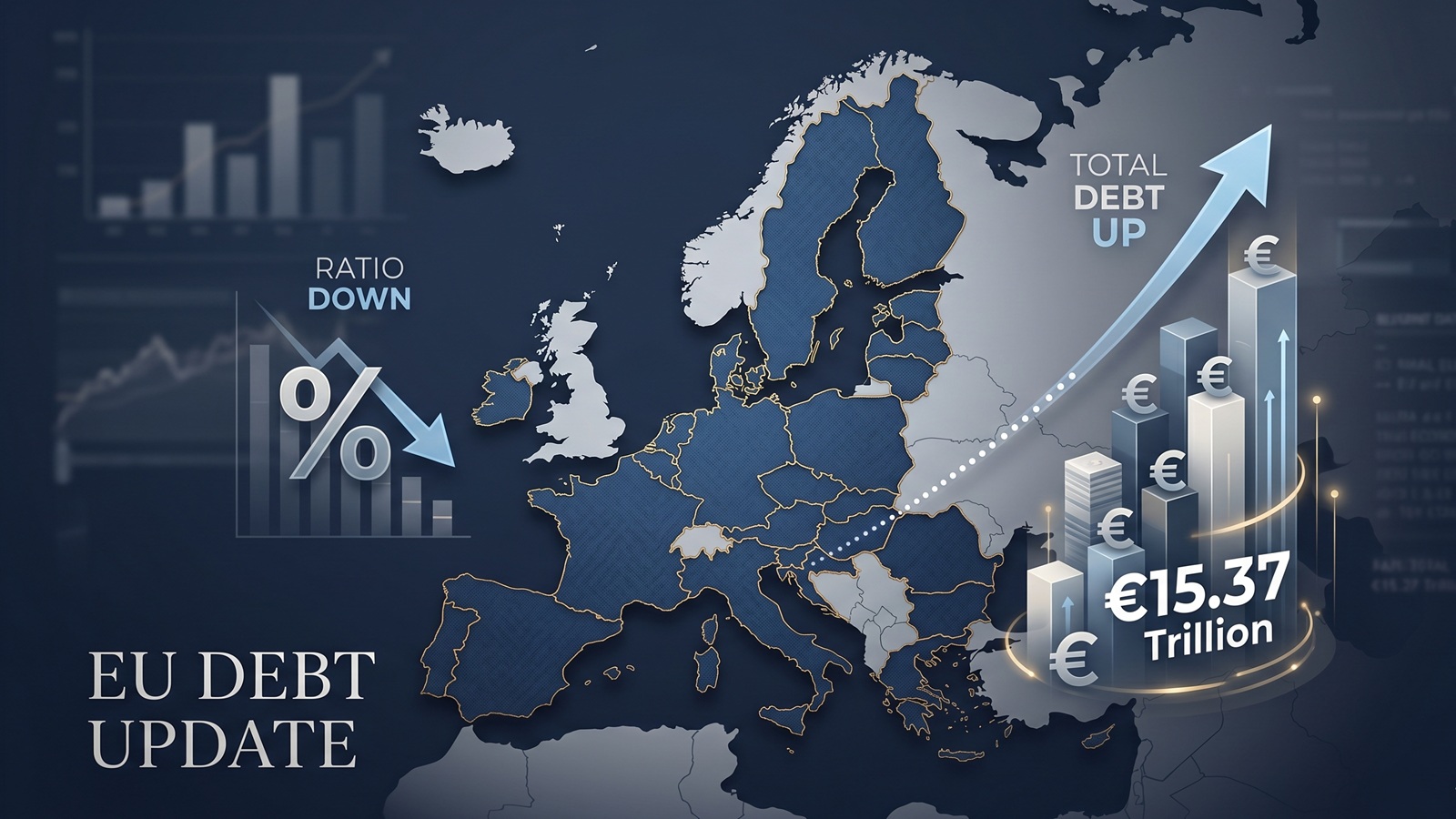
EU debt update: the ratio fell, but the pile still grew to €15.37tn
The latest Eurostat release offers a picture that looks calmer than it really is. The EU debt ratio edged down in late 2025, but the total stock of government debt still rose to more than €15.37tn.
EU Debt Explained: Why Adding It All Up Helps, and Misleads
Add together the public debt of all 27 EU countries and the total comes to more than €15 trillion. That number is useful, especially on a live map, but it can also mislead because Europe does not borrow like a single country.

Europe’s debt isn’t exploding — but something feels different in 2026
There’s no sudden debt crisis in Europe. But if you look closely, the direction is shifting. And that shift could matter more than the actual numbers.

Born with a €58,000 Mortgage? The 2026 Debt-per-Capita Map of Europe
New 2026 projections reveal a massive financial divide. While a Dutch citizen needs 9 months of work to pay off their share of the national debt, an Italian needs over 2 years.

The Fiscal Frontline: Can Europe Afford to Rearm While Cutting Debt?
As 2026 begins, Europe faces a paralyzing paradox: the geopolitical imperative to rearm meets the rigid reality of reinstated fiscal rules.