Europe’s Debt Thermometer, Q2 2025: Who’s Up, Who’s Down — and Why It Matters

Intro
Eurostat’s latest release for Q2 2025 paints a picture of contrast across Europe. On the surface, EU government debt edged only slightly higher overall. But beneath that calm average, national ratios moved in opposite directions — some climbing fast, others falling. It’s a story of economies adjusting to slower growth, tighter budgets, and higher interest costs.
TL;DR — 30 seconds
- What changed: Quarter-on-quarter shifts in general government gross debt (% of GDP) across EU countries.
- Why it matters: Debt ratios respond to more than just borrowing — GDP growth, inflation, and financing conditions all play a role.
- Key takeaway: The quarter’s biggest movers reveal the push and pull between economic growth, fiscal deficits, and interest-rate pressure.
The European snapshot
Instead of a static map, imagine Europe’s economies as people moving through a crowded city square — some pushing ahead, others slowing down. The overall flow looks steady, but each step hides a different pace. That’s what this quarter’s data shows: diverse momentum under one European headline.
Biggest risers (Q2 vs Q1)
Several countries saw debt ratios increase, often due to soft GDP figures or continued deficits. Even modest borrowing can translate into higher ratios when growth weakens. For some economies, Q2 brought that combination of lower output and rising financing costs.
- Signal: Slower growth or persistent primary deficits.
- Reading tip: A rising ratio doesn’t always mean a borrowing surge — the denominator effect can amplify modest changes.
Biggest decliners (Q2 vs Q1)
Other countries managed to cut their ratios, thanks to robust GDP growth, tight fiscal control, or one-off repayments. The contrast highlights how economic strength and discipline still pay off, even in a high-rate environment.
- Signal: Expanding economies or targeted debt reduction.
- Reading tip: Strong nominal growth compresses debt ratios quickly — often faster than new borrowing adds to them.
What drives the divergence?
1) The denominator effect
When GDP stalls or contracts, the ratio rises even if debt remains flat. Conversely, growth lowers the ratio without any debt repayment. That’s why weak economies saw upticks this quarter, while stronger ones saw declines.
2) Budgets and one-offs
Fiscal choices still matter. Some governments boosted spending on defence or energy transitions, others continued consolidation. One-time factors like debt repayments or delayed projects also shaped quarterly moves.
3) The rate echo
Interest costs are back. After a decade of cheap money, refinancing at higher yields now absorbs more budget room. Countries with short maturities or large rollover needs feel this most — it’s the invisible weight behind several rising ratios.
Levels still matter
Short-term movements grab headlines, but long-term vulnerability depends on both debt level and trend. High-debt countries face higher interest sensitivity; low-debt ones have more buffer — yet all remain exposed when growth fades.
Looking toward 2026
- Fiscal rules return: The EU’s reformed framework will test countries drifting upward. Credible, growth-friendly adjustment paths will be key.
- Growth vs. rates: If real interest rates stay above growth, stabilising debt becomes a challenge — a risk especially for slower economies.
- Investor view: Credit markets are watching who flattens the curve and who keeps climbing.
Quick Q&A
What is “debt-to-GDP”? It’s the ratio of total government debt to the size of the economy — a measure of fiscal sustainability. The ratio can rise even without new borrowing if GDP shrinks.
Why do quarters swing? Timing of outlays, seasonal tax flows, and GDP revisions can all nudge the numbers.
Quarter or trend? Both. Quarterly data shows direction; long-term trends reveal resilience.
Method in four lines
- Compare Q2 2025 with Q1 2025 government debt ratios (% of GDP).
- Explain shifts through growth (denominator), budget balance, and refinancing cost.
- Combine level and trend for a stability view, not the quarter alone.
- Source: Eurostat official release, October 2025.
Further reading
Further Reading
Analysis and data you might have missed

Europe’s Debt Burden in 2026: Which EU Countries Are Under the Most Pressure?
Europe’s public debt is not spread evenly. This data-backed analysis explains why total debt and debt-to-GDP tell two different stories about fiscal pressure in the EU.
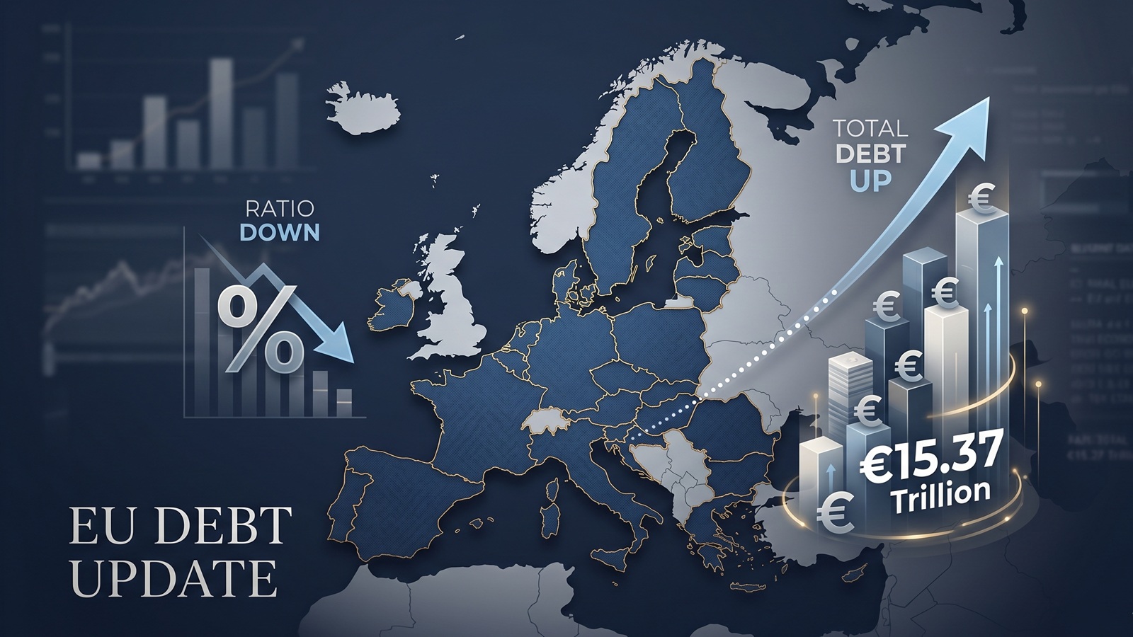
EU debt update: the ratio fell, but the pile still grew to €15.37tn
The latest Eurostat release offers a picture that looks calmer than it really is. The EU debt ratio edged down in late 2025, but the total stock of government debt still rose to more than €15.37tn.

EU Debt Explained: Why Adding It All Up Helps, and Misleads
Add together the public debt of all 27 EU countries and the total comes to more than €15 trillion. That number is useful, especially on a live map, but it can also mislead because Europe does not borrow like a single country.

Europe’s debt isn’t exploding — but something feels different in 2026
There’s no sudden debt crisis in Europe. But if you look closely, the direction is shifting. And that shift could matter more than the actual numbers.

The Dollar Dives, The Euro Thrives: A Silent Crisis for Europe's Debt Mountain?
As the Greenback stumbles, the Euro is gaining ground. While tourists cheer, Brussels holds its breath. We analyze how the shifting FX landscape threatens to rewrite the map of European sovereign debt.

Born with a €58,000 Mortgage? The 2026 Debt-per-Capita Map of Europe
New 2026 projections reveal a massive financial divide. While a Dutch citizen needs 9 months of work to pay off their share of the national debt, an Italian needs over 2 years.