Netherlands National Debt in 2025: What the Live Counter Shows (and What It Means)
Intro
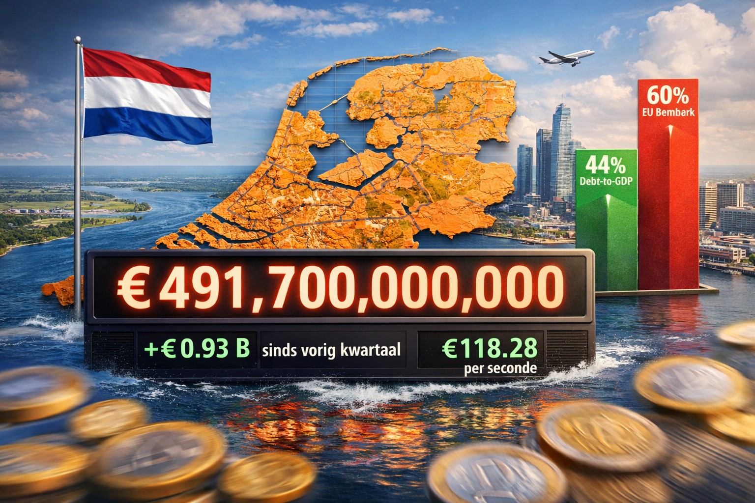
The Netherlands is often described as one of the more fiscally cautious countries in the EU, yet its public debt still moves every second. On the EU Debt Map Netherlands page, you can watch a live counter that estimates the country’s general government gross debt in real time, using Eurostat as the baseline.
The Netherlands debt snapshot (live estimate)
At the time of writing, EU Debt Map shows:
- Estimated public debt (live): ≈ €491.7 billion
- Change vs. last quarter: +€0.93 billion (about +0.19%)
- Implied pace: ≈ €118.28 per second
- Debt-to-GDP context: the page description also references nominal GDP ≈ €1.12 trillion, implying a debt-to-GDP ratio around 44%
Important: the “live” number is an educational estimate. The underlying quarterly debt data is official (Eurostat), but the second-by-second motion is a projection between releases.
What the live counter actually measures
EU Debt Map uses Eurostat’s quarterly dataset for general government gross debt under the Maastricht definition (dataset: gov_10q_ggdebt). In plain terms: this is the stock of government debt, not the annual deficit. It’s reported quarterly, then turned into a visual that updates continuously.
How quarterly debt becomes a per-second ticker
The methodology is transparent and intentionally simple:
- The site keeps the last two quarterly reference points for each country.
- It computes an average € per second rate from the change between those two quarters and the time between them.
- Between the two reference dates, it linearly interpolates; after the most recent date, it linearly extrapolates using the same rate.
For the Netherlands page, the reference window is explicitly shown (the last two Eurostat reference dates), alongside the implied €-per-second rate and the change since the previous quarter.
Is ~44% debt-to-GDP “high”?
One widely cited EU benchmark is the 60% debt-to-GDP reference value. EU Debt Map highlights this threshold in its Debt-to-GDP explainer. A ratio around 44% sits below that 60% reference value, which is commonly interpreted as giving a country more fiscal room than peers above the threshold.
Why debt can rise even when the economy is doing fine
Public debt isn’t only about crises. It can rise (or fall) for several reasons:
- Budget balance: deficits add to debt; surpluses can reduce it.
- Refinancing and interest conditions: changing rates affect the cost of servicing and rolling over debt.
- One-off measures: support packages, large investments, or financial interventions can shift financing needs.
- GDP effects: the ratio can improve even if debt rises, if GDP grows faster (and worsen if GDP falls).
How to interpret the live number responsibly
- Direction over precision: treat the second-by-second value as a visual trend signal.
- Check the reference dates: the “speed” is the average change between the last two quarters, not a literal real-time stream of borrowing.
- Compare smartly: absolute debt size matters, but so do ratios and whether debt is rising or falling.
Takeaway
The Netherlands’ public debt is large in absolute euros (hundreds of billions), but the debt-to-GDP context presented by EU Debt Map (around 44%) is still below the EU’s widely cited 60% reference value. The live counter is most useful as a “pulse” that turns slow-moving quarterly statistics into an intuitive visual—while staying grounded in official Eurostat data.
Further Reading
Analysis and data you might have missed

Europe’s Debt Burden in 2026: Which EU Countries Are Under the Most Pressure?
Europe’s public debt is not spread evenly. This data-backed analysis explains why total debt and debt-to-GDP tell two different stories about fiscal pressure in the EU.
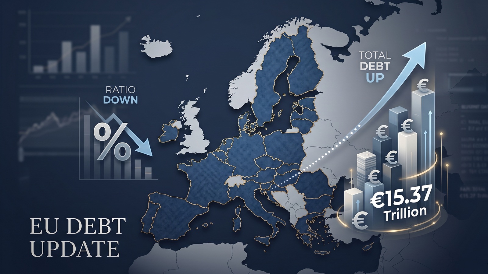
EU debt update: the ratio fell, but the pile still grew to €15.37tn
The latest Eurostat release offers a picture that looks calmer than it really is. The EU debt ratio edged down in late 2025, but the total stock of government debt still rose to more than €15.37tn.

EU Debt Explained: Why Adding It All Up Helps, and Misleads
Add together the public debt of all 27 EU countries and the total comes to more than €15 trillion. That number is useful, especially on a live map, but it can also mislead because Europe does not borrow like a single country.

Europe’s debt isn’t exploding — but something feels different in 2026
There’s no sudden debt crisis in Europe. But if you look closely, the direction is shifting. And that shift could matter more than the actual numbers.

The Dollar Dives, The Euro Thrives: A Silent Crisis for Europe's Debt Mountain?
As the Greenback stumbles, the Euro is gaining ground. While tourists cheer, Brussels holds its breath. We analyze how the shifting FX landscape threatens to rewrite the map of European sovereign debt.

Born with a €58,000 Mortgage? The 2026 Debt-per-Capita Map of Europe
New 2026 projections reveal a massive financial divide. While a Dutch citizen needs 9 months of work to pay off their share of the national debt, an Italian needs over 2 years.