The 'Swedish Wonder': National debt is falling and the live tracker is green

The map is turning green
Anyone opening the EU Debt Map will see a chart dominated by red spots: countries where national debt is increasing every second. But one country in the north stands out: Sweden. The tracker for Sweden is colored green, indicating that its debt is not rising, but *falling*.
This is no accident; it's the result of disciplined fiscal policy. While France (+€9,115/sec) and even the Netherlands (+€118/sec) are watching their debts grow, the live tracker for Sweden shows a negative number.
Top of the Class
Sweden has one of the lowest national debts in the entire European Union. Where the Maastricht treaty sets a limit of 60% of Gross Domestic Product (GDP), Sweden is spectacularly below it.
Recent Eurostat figures and data from the Swedish National Debt Office (Riksgälden) confirm that the debt-to-GDP ratio is hovering around **33.5%**. For comparison, the Netherlands is at 43%, and the EU average is over 80%.
How do they do it (outside the Euro)?
A crucial difference compared to countries like the Netherlands and France is that Sweden does not use the Euro; it has its own currency: the Swedish Krona (SEK). This means they can determine their own monetary policy via their central bank, the Riksbank.
This flexibility, combined with a strict fiscal framework, has paid off. The Swedish government recently even reported *budget surpluses*. Simply put: more money is coming in than going out, allowing the national debt to be actively paid down.
See the decline for yourself
It's fascinating to watch the Swedish counter run backward while its neighbors' trackers rise. Click on the Swedish national debt page on the EU Debt Map and see for yourself what the 'Swedish model' looks like in real-time. Compare it to the rest of Europe and witness the contrast with your own eyes.
Further Reading
Analysis and data you might have missed

Europe’s Debt Burden in 2026: Which EU Countries Are Under the Most Pressure?
Europe’s public debt is not spread evenly. This data-backed analysis explains why total debt and debt-to-GDP tell two different stories about fiscal pressure in the EU.
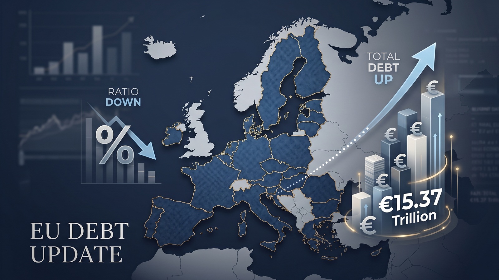
EU debt update: the ratio fell, but the pile still grew to €15.37tn
The latest Eurostat release offers a picture that looks calmer than it really is. The EU debt ratio edged down in late 2025, but the total stock of government debt still rose to more than €15.37tn.

EU Debt Explained: Why Adding It All Up Helps, and Misleads
Add together the public debt of all 27 EU countries and the total comes to more than €15 trillion. That number is useful, especially on a live map, but it can also mislead because Europe does not borrow like a single country.

Europe’s debt isn’t exploding — but something feels different in 2026
There’s no sudden debt crisis in Europe. But if you look closely, the direction is shifting. And that shift could matter more than the actual numbers.

The Dollar Dives, The Euro Thrives: A Silent Crisis for Europe's Debt Mountain?
As the Greenback stumbles, the Euro is gaining ground. While tourists cheer, Brussels holds its breath. We analyze how the shifting FX landscape threatens to rewrite the map of European sovereign debt.

Born with a €58,000 Mortgage? The 2026 Debt-per-Capita Map of Europe
New 2026 projections reveal a massive financial divide. While a Dutch citizen needs 9 months of work to pay off their share of the national debt, an Italian needs over 2 years.