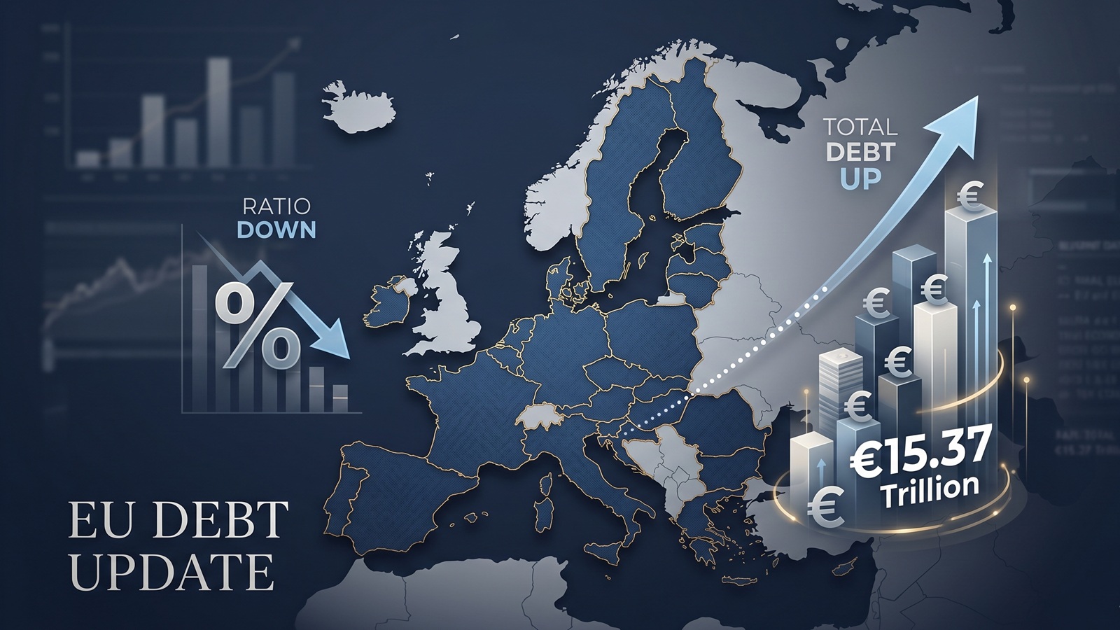
EU debt update: the ratio fell, but the pile still grew to €15.37tn
The latest Eurostat debt release looks reassuring at first glance. At the end of the fourth quarter of 2025, the EU debt-to-GDP ratio slipped from 82.0% to 81.7%. That sounds like a step in the right direction. And in one sense, it is.
But the calmer headline hides a less comfortable reality. The total stock of EU government debt did not fall. It rose. In absolute terms, it increased from about €15.26tn in the third quarter to roughly €15.37tn in the fourth. The ratio improved because GDP grew faster than debt, not because Europe suddenly started borrowing less.
That distinction matters. Ratios are essential. They tell you how heavy the debt burden is relative to the size of the economy. But absolute debt still matters too, especially when refinancing costs, fiscal flexibility and political room are getting more attention again across Europe.
The headline looked better than the underlying number
This is the core of the new update. Europe did not become debt-free. It became slightly more comfortable carrying a still larger debt pile.
That may sound like a technical point, but it changes how the release should be read. A falling debt ratio invites the easy conclusion that pressure is fading. Yet a rising nominal debt stock means governments are still adding to the amount that has to be managed, refinanced and defended politically later on.
That is why a live map can help. On the EU Debt Map homepage, the combined number does not sit still. It moves. That visual does not replace the ratio, but it does stop the story from sounding tidier than it really is.
The map underneath the total is uneven
The broad EU figure also hides how different the national picture still is. According to Eurostat, the highest debt ratios at the end of 2025 Q4 were recorded in Greece, Italy, France, Belgium and Spain. At the other end were Estonia, Luxembourg, Denmark and Bulgaria.
That matters because one European debt story does not really exist. There are several, all moving at different speeds. France remains one of the heavyweight cases. Germany is still in a much lower ratio zone. Southern Europe is not moving in lockstep. Smaller countries can shift quickly in percentage terms even when the absolute numbers are much smaller.
On our homepage, France currently shows as the largest debt pile on the live map, while Germany appears as the fastest-growing live estimate. That contrast alone says more than the aggregate headline ever could. Europe is one map, but not one borrower.
The most interesting part of this release is who moved
If you only look at the EU average, you miss the sharper movements underneath. Compared with the third quarter of 2025, the biggest rises in debt-to-GDP were seen in Latvia and the Netherlands, followed by Sweden, Poland, Finland and Bulgaria. The steepest falls were in Portugal, Cyprus, Greece and Spain.
That mix tells a more interesting story than the aggregate ratio. Some countries used growth to make debt look lighter. Others saw the burden rise even within a quarter. In other words, the direction of travel inside Europe remains fragmented.
That is also why country pages matter more after a release like this. A single EU ratio can move by a few tenths and still leave major national shifts hidden in the background. The aggregate is the hook. The national differences are the real analysis.
Why this matters in 2026
There is no obvious debt panic in Europe right now. The latest numbers do not look like a crisis chart. That is exactly why they are easy to underestimate.
The risk is not always an explosion. Sometimes it is a slow thickening of the debt pile while governments tell themselves that the ratio is manageable. That can be true for a while. But it also means every future shock starts from a larger nominal base.
And that is the part worth watching. The question is not only whether debt is high relative to GDP. It is whether governments are quietly losing room to respond before voters or markets fully notice.
The better way to read this release
The simplest reading of today’s Eurostat release would be this: Europe’s debt ratio edged down, so the picture improved. That is not wrong. It is just incomplete.
A more honest reading is this: the ratio improved a little, but the debt pile still got bigger. Europe bought itself a slightly better denominator, not a smaller obligation.
That is why both views belong together. If you want the broad picture, start with the EU overview. If you want to understand what the update really means, split the map apart again and compare countries side by side. The total tells you how large the story is. The country pages tell you where the pressure is actually building.
Further Reading
Analysis and data you might have missed

Europe’s Debt Burden in 2026: Which EU Countries Are Under the Most Pressure?
Europe’s public debt is not spread evenly. This data-backed analysis explains why total debt and debt-to-GDP tell two different stories about fiscal pressure in the EU.

EU Debt Explained: Why Adding It All Up Helps, and Misleads
Add together the public debt of all 27 EU countries and the total comes to more than €15 trillion. That number is useful, especially on a live map, but it can also mislead because Europe does not borrow like a single country.

Europe’s debt isn’t exploding — but something feels different in 2026
There’s no sudden debt crisis in Europe. But if you look closely, the direction is shifting. And that shift could matter more than the actual numbers.

The Dollar Dives, The Euro Thrives: A Silent Crisis for Europe's Debt Mountain?
As the Greenback stumbles, the Euro is gaining ground. While tourists cheer, Brussels holds its breath. We analyze how the shifting FX landscape threatens to rewrite the map of European sovereign debt.

Born with a €58,000 Mortgage? The 2026 Debt-per-Capita Map of Europe
New 2026 projections reveal a massive financial divide. While a Dutch citizen needs 9 months of work to pay off their share of the national debt, an Italian needs over 2 years.

The Fiscal Frontline: Can Europe Afford to Rearm While Cutting Debt?
As 2026 begins, Europe faces a paralyzing paradox: the geopolitical imperative to rearm meets the rigid reality of reinstated fiscal rules.